Building a safer, stronger, prosperous Territory
The NT Government has set 3 clear priorities for the Territory’s future: to reduce crime, rebuild the economy and restore our lifestyle.
Learn more
News
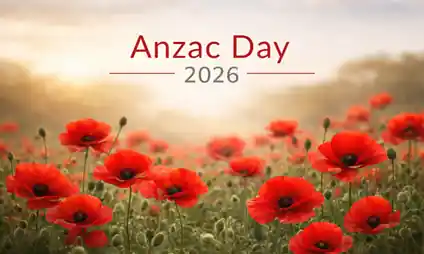
Anzac Day 2026
Anzac Day 2026 will be commemorated across the Northern Territory on Saturday 25 April.

ICT/cybersecurity providers invited to Cyber Invest Business Program information session
If you're an ICT/cybersecurity service provider delivering managed services and cybersecurity uplift to small business, attend an online information session about Cyber Invest Business Program.

Private Security Act 1995 review opens for public consultation
The Northern Territory Government is undertaking a review of the Private Security Act 1995 to ensure the Territory’s regulatory framework continues to meet the needs of industry and the community.
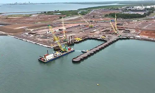
East Arm businesses invited to Northern Marine Complex information session
Businesses and landowners in East Arm are invited to attend an on-site information session to hear about the next phase of development for the Northern Marine Complex.

Have your say: Review of the Associations Act 2003
The Northern Territory Government is inviting feedback from the community as part of a review of the Associations Act 2003, ensuring the legislation continues to meet the needs of incorporated associations across the Territory.

Cutting red tape for Territory businesses and community organisations
Legislation changes will make it easier for real estate agents’ representatives and incorporated associations to do business in the Northern Territory, reducing red tape and increasing efficiencies for a range of occupational licences and processes.

Have Your Say: whole-of-Territory workforce development strategy
The Northern Territory Government is developing a whole-of-Territory workforce development strategy to address ongoing skills shortages, to strengthen the Territory’s workforce outcomes and to deliver growth.

Higher risk weather season
Northern Territory Emergency Service (NTES) and the Bureau of Meteorology (BOM) officially launched the 2025 Higher Risk Weather Season program, running from now until April 2026. The program runs from 1 October 2025 to 30 April 2026.

October Business Month 2025 program released
The calendar of events for October Business Month 2025 has been released with over 200 events to help Territory businesses grow.

Procurement Reforms
The Northern Territory Government is modernising its procurement practices to make it easier to do business in the Territory.

Introducing the Territory Business Advisors
The Northern Territory Government has rebranded its frontline business support roles, bringing together Small Business Champions, Workforce Development Officers and Industry Development Officers under a new unified title – Territory Business Advisors.

October Business Month keynote speakers announced
The keynote speakers for October Business Month (OBM) 2025 have been revealed with two of Australia’s leading entrepreneurs headlining this year’s program.

With a rapidly growing economy, industries and major developments, the Territory is an exciting place to call home. Just moved or in the planning stage - join us.